Logo & brand identity for a building materials store
- Client
- Berkut Center
- Role
- Brand Design
- Services
- Logo Design, Brand Identity, Signage Design
- Logo Design
- Brand Identity
- Signage Design
Overview
Berkut Center sells building materials from trusted manufacturers in Uzhhorod, Ukraine. The store needed a brand as solid as its products and easy to spot from the road.
The logo
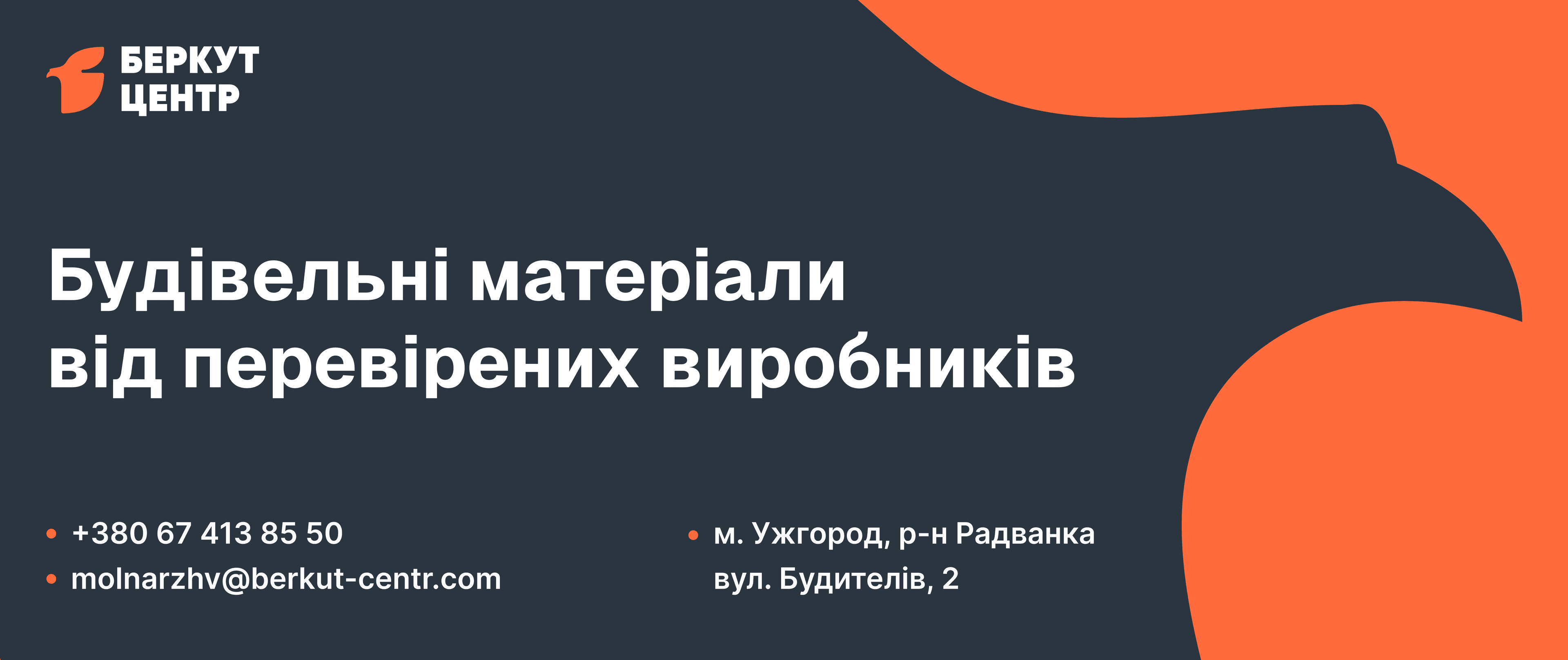
Berkut is Ukrainian for golden eagle. The mark turns the eagle's head into a compact, angular symbol next to a heavy, all-caps Cyrillic wordmark. It stays legible at any size, from a small print to a roadside billboard.

Colour and graphic language
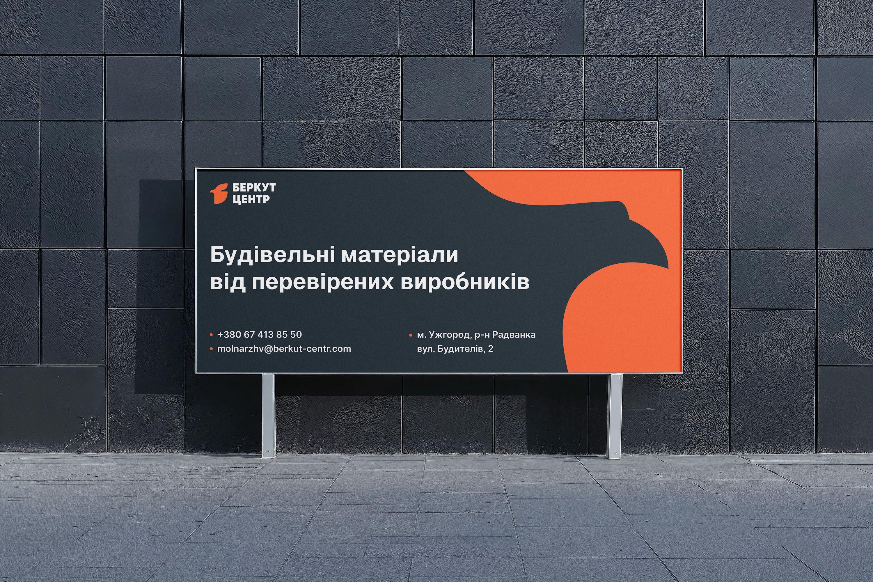
Warm orange against deep graphite gives the brand a confident, practical feel that suits the building trade. An oversized eagle silhouette works as a supergraphic: it crops into layouts and gives every surface a recognisable edge.
What was created
- 01Logo and Cyrillic wordmark
- 02Colour palette and eagle supergraphic
- 03Outdoor billboard and banner layouts with contact details
Next case · Illustrated Project
Illustrated postcards for a café