Brand system for a solar energy company
- Client
- Proso Energy
- Role
- Brand & UI/UX Designer
- Year
- 2025
- Services
- Brand Identity, Brand Guidelines, Social Media, Print, UI/UX Design
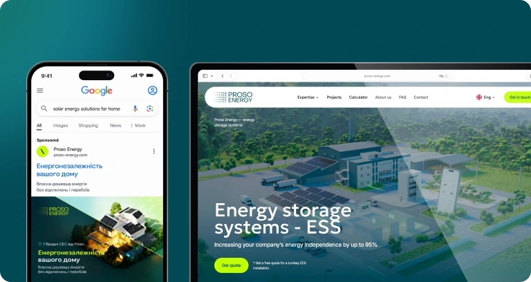 Website & Ads Campaigns
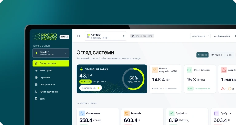 Web & Mobile App | Energy Management System (EMS)
- Brand Identity
- Brand Guidelines
- Social Media
- UI/UX Design
Overview
Proso Energy installs solar stations and energy storage for businesses and homes in Ukraine. I built their identity into a full brand system — guidelines, digital and print templates — and designed the UI of their energy management app.
Proso Energy builds solar power stations and energy storage systems for businesses and homes in Ukraine. The company had a logo, but no system: every banner, post and print file looked different, and nothing explained a technical product in a way people could trust.
- 01Energy independence is a technical, high-ticket purchase — the brand had to feel reliable before it felt exciting.
- 02Two audiences, one identity: business owners calculating ROI and households thinking about blackouts.
- 03A small marketing team needed to produce new materials every week without a designer in the loop.
Brand design
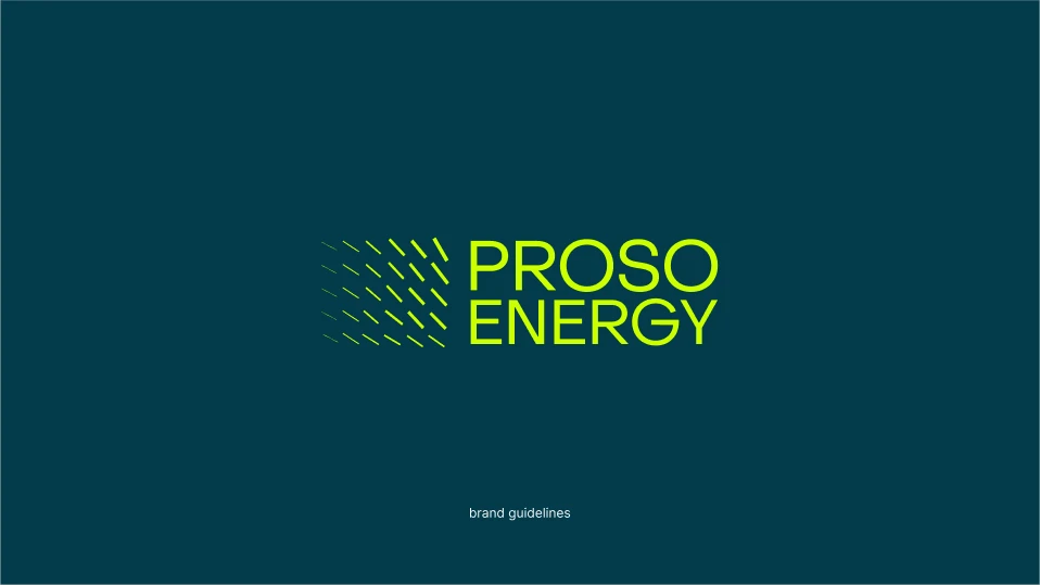
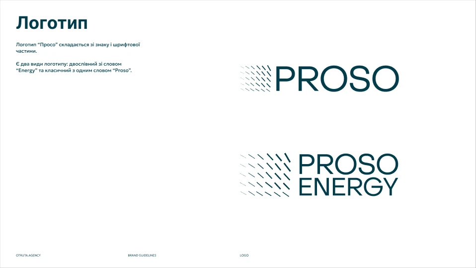
Identity system
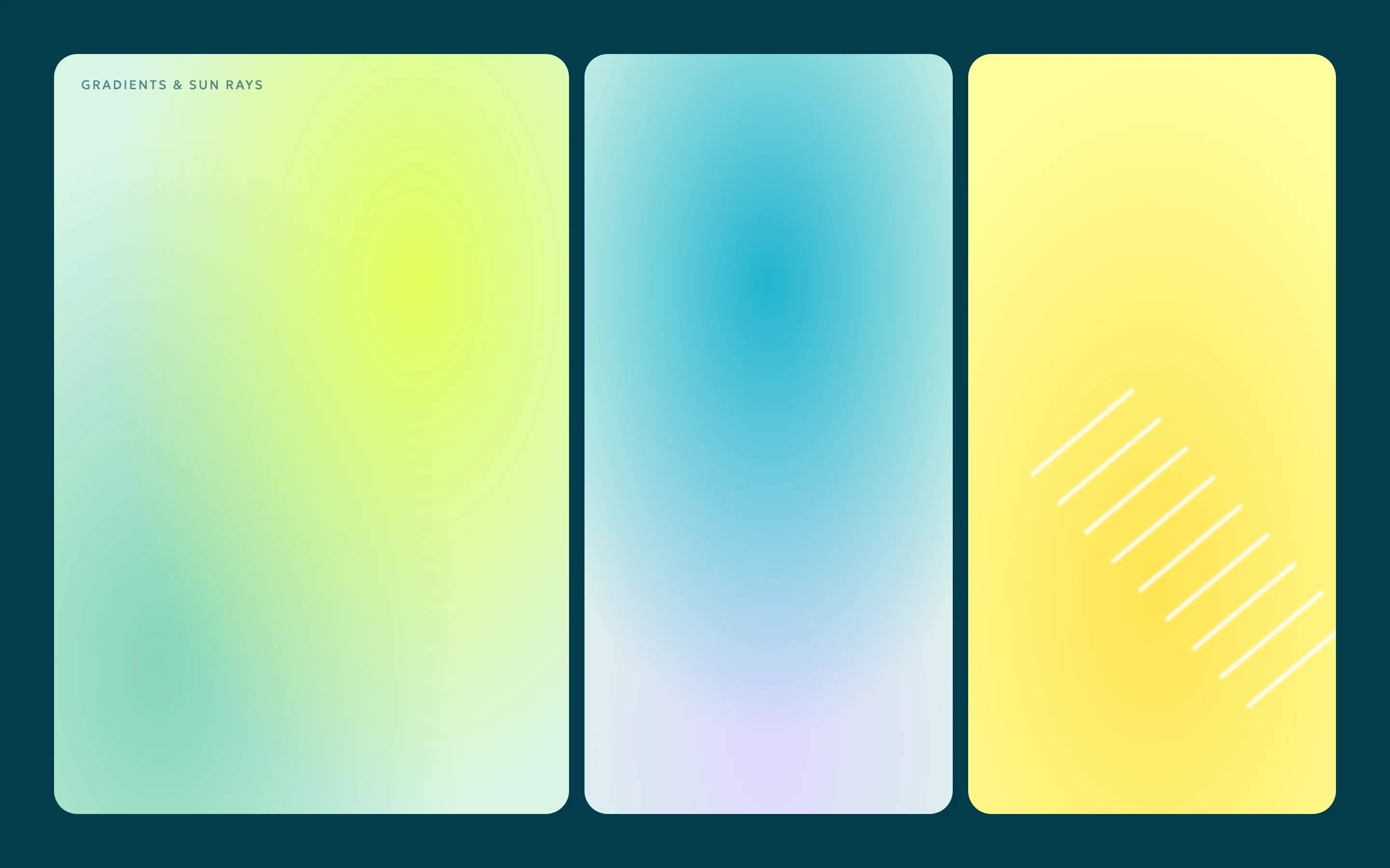
I built the brand on two colours and one idea. Deep petrol blue for trust, electric lime for energy — and “sun rays”: soft blurred strokes inspired by solar panels and warm light, used sparingly as the brand's signature.
- 01Logo in two versions: the full Proso Energy lock-up and a compact Proso mark, with clear-space and minimum-size rules.
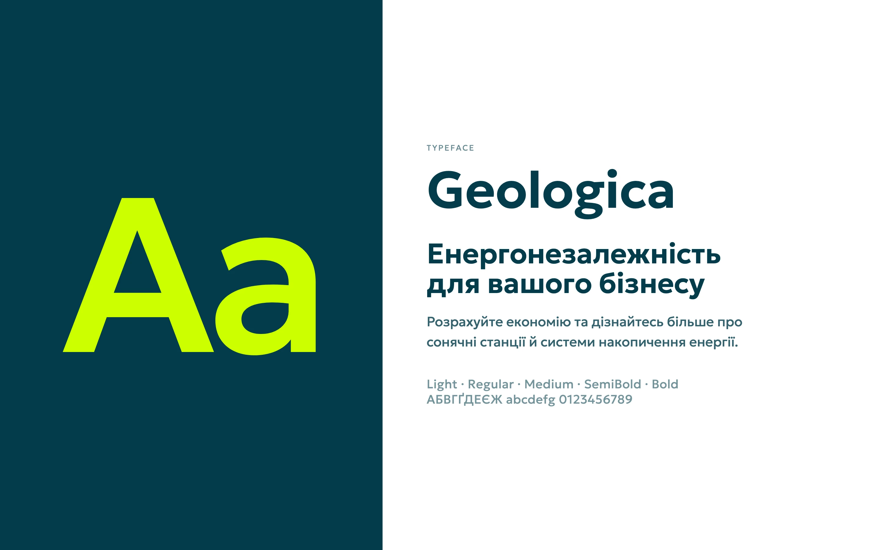
- 02Geologica as the single typeface: headlines on screen, headlines and body text in print.
- 03A colour system with primary, secondary and text colours, plus non-linear gradients that work as backgrounds on any format.
- 04An icon style and design elements the team can reuse instead of redrawing.
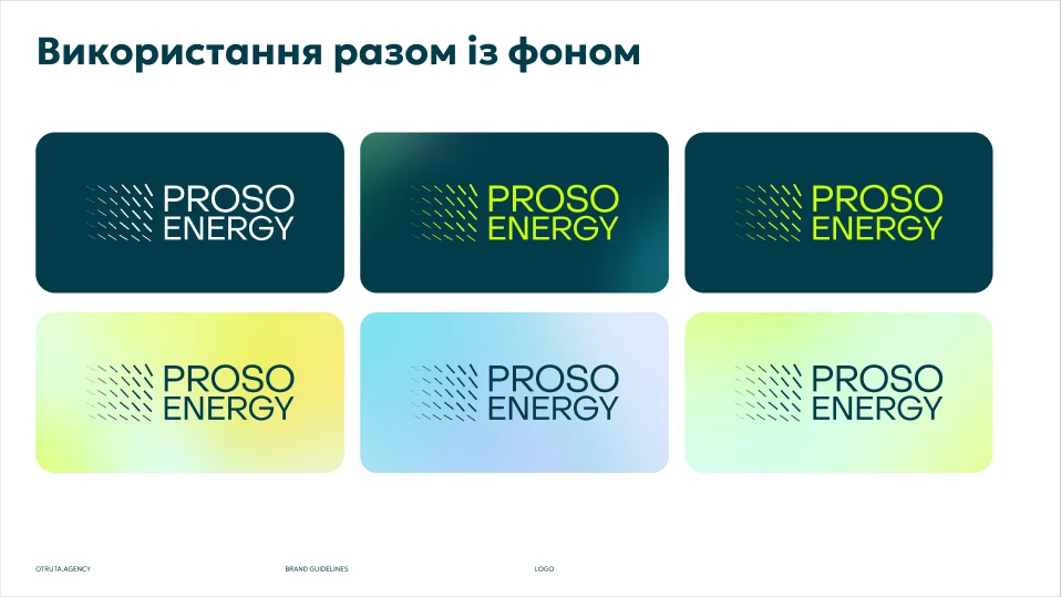
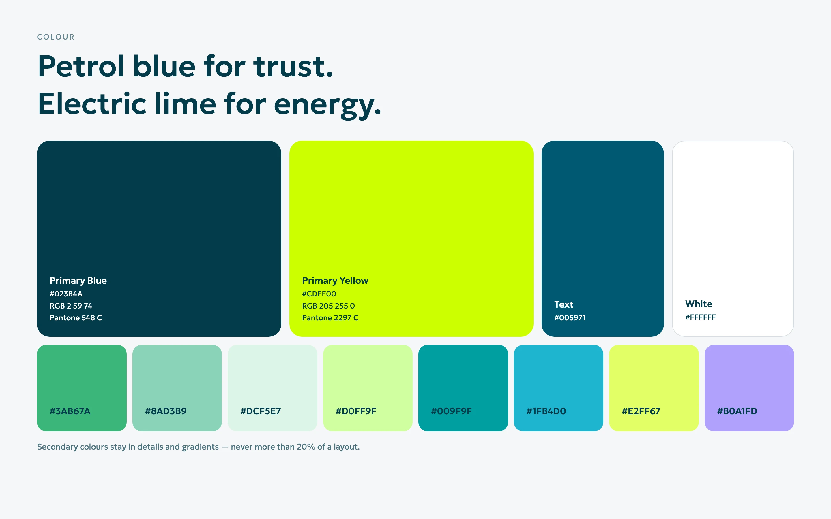
Colour palette
4 primary · 8 secondary- Primary blue#023B4A
RGB 2 59 74 - Primary yellow#CDFF00
RGB 205 255 0 - Text#005971
RGB 0 89 113 - White#FFFFFF
RGB 255 255 255 - Secondary#3AB67A
RGB 58 182 122 - Secondary#8AD3B9
RGB 138 211 185 - Secondary#DCF5E7
RGB 220 245 231 - Secondary#D0FF9F
RGB 208 255 159 - Secondary#009F9F
RGB 0 159 159 - Secondary#1FB4D0
RGB 31 180 208 - Secondary#E2FF67
RGB 226 255 103 - Secondary#B0A1FD
RGB 176 161 253
Brand guidelines
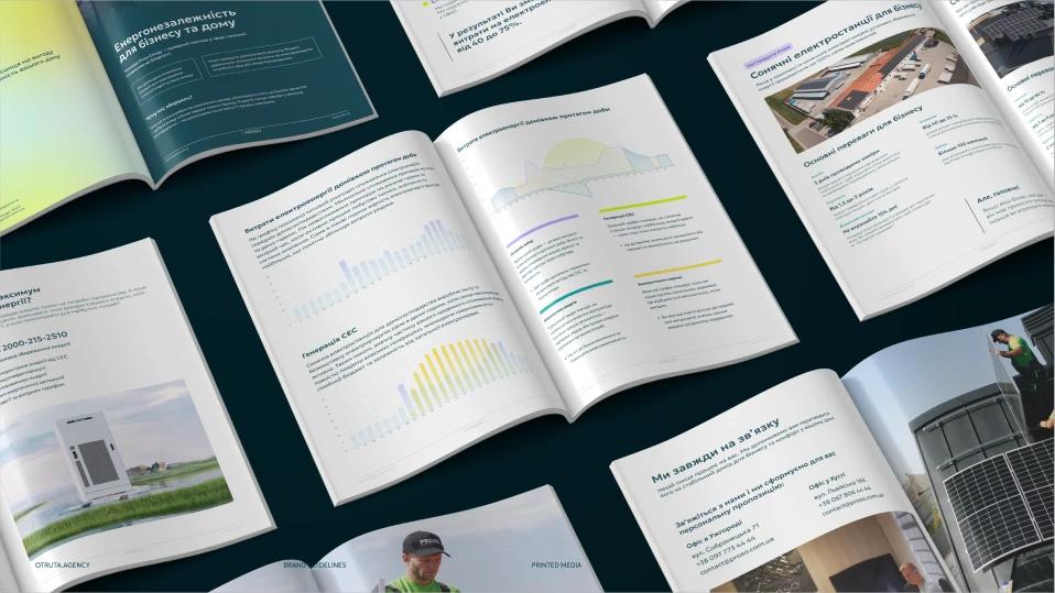
Everything went into a brand book the team actually uses: logo, typography, colour, gradients, design elements, digital and print. It includes do’s and don’ts with real Proso layouts — where the logo sits on a banner, how much space it needs — because the most common mistakes were in everyday ads, not in the logo itself.
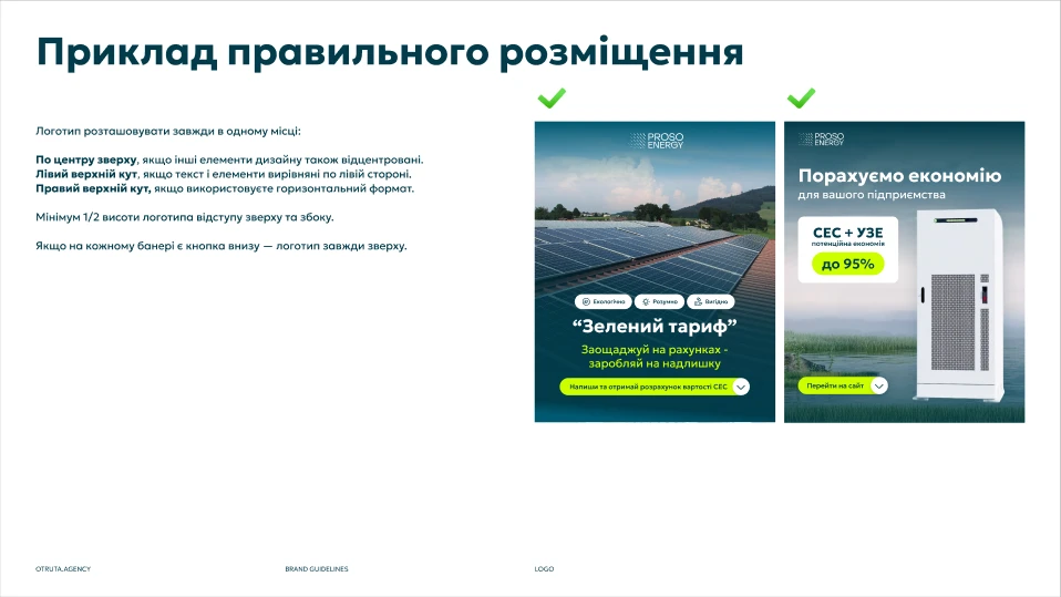
Correct logo placement on ads, from the brand guidelines.
Digital & social
- 01Google Ads creatives and search campaigns for home and business solar.
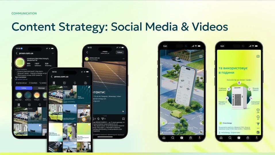
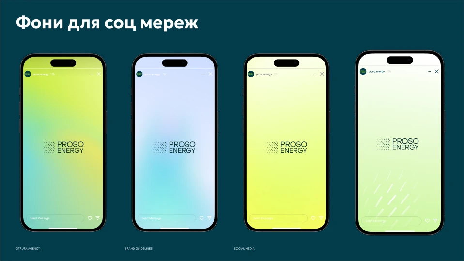
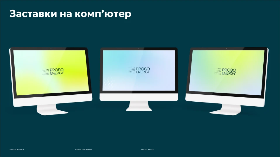
- 02Social media system: post and story templates, highlight covers, profile backgrounds and covers for YouTube and Facebook.
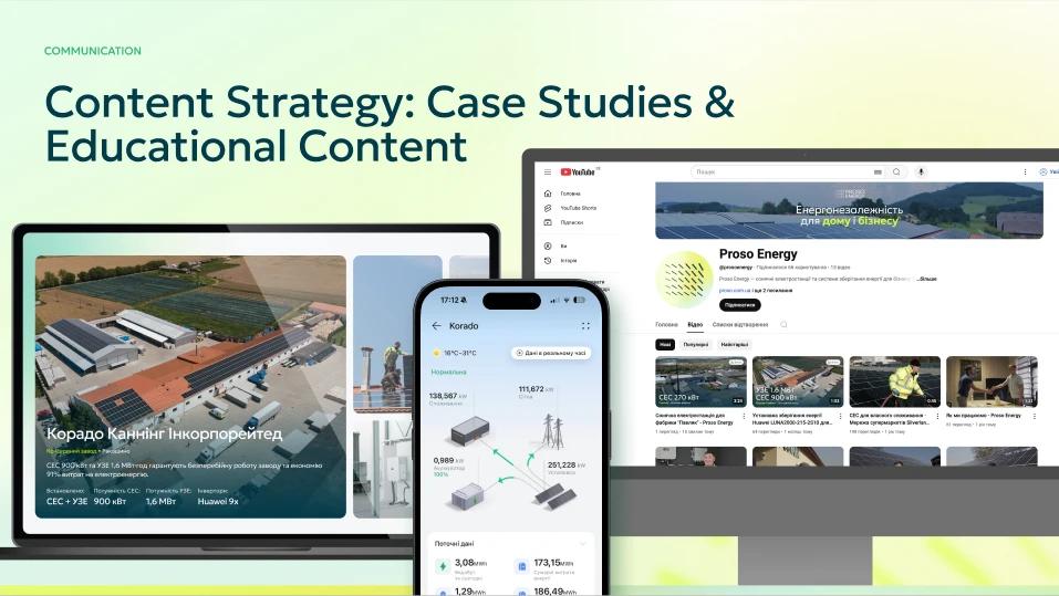
- 03Content formats for case studies and educational posts that explain solar and storage in plain language.
- 04Email signatures and presentation templates for the sales team.
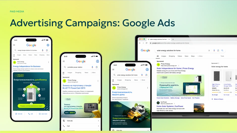
Google Ads campaigns.
Print & brand presence
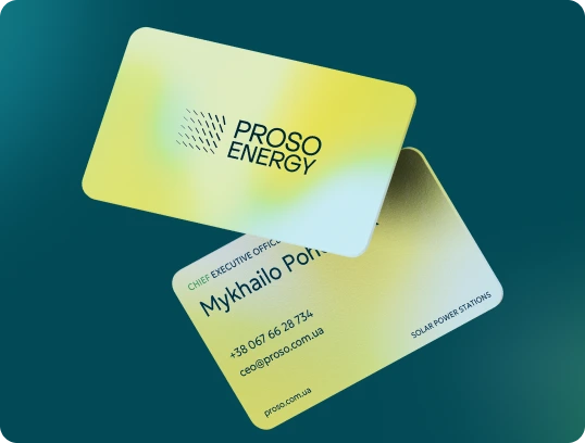
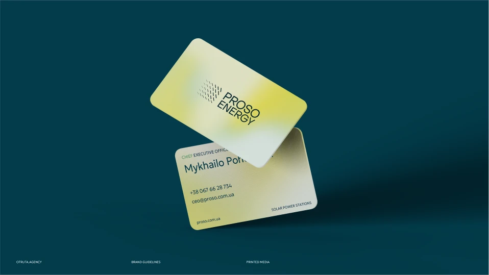
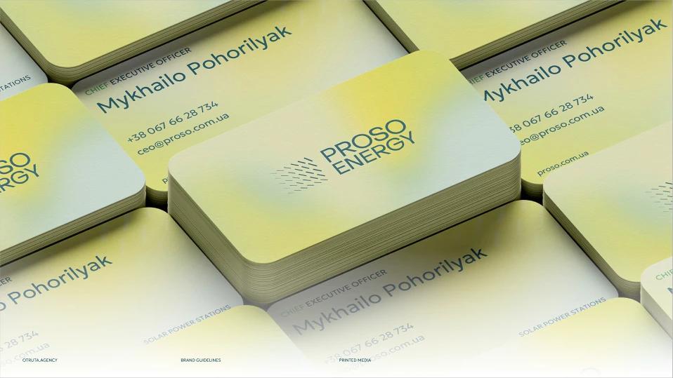
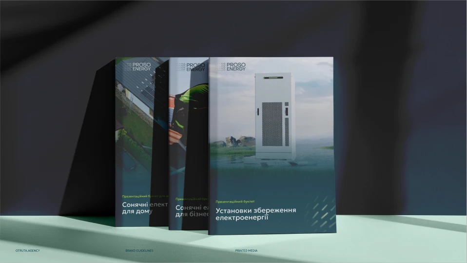
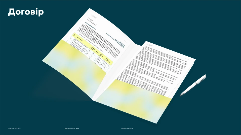
- 01Business cards, folders, booklets and catalogues.
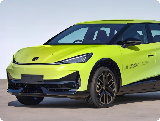
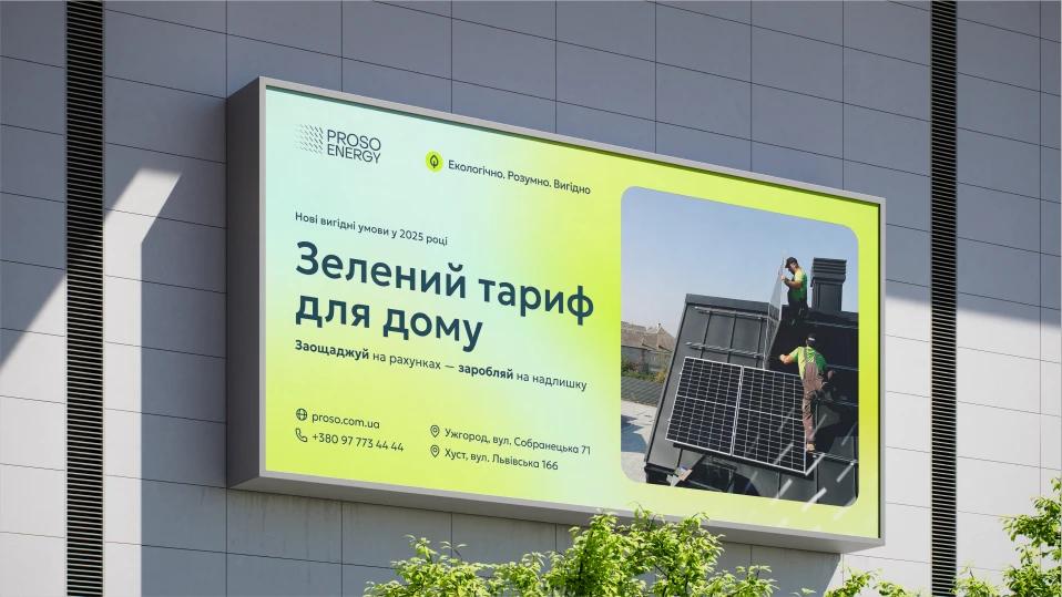
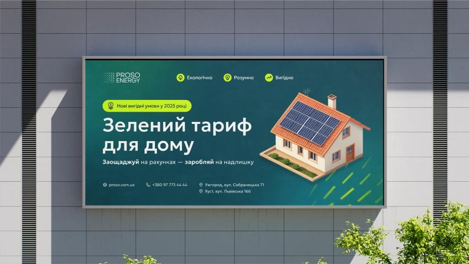
- 02Branded vehicles and outdoor banners.
- 03Merchandise and equipment branding: inverter stickers, phone cases, lanyards, T-shirts, packaging.
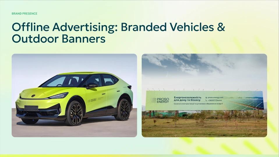
Branded vehicles and outdoor banners.
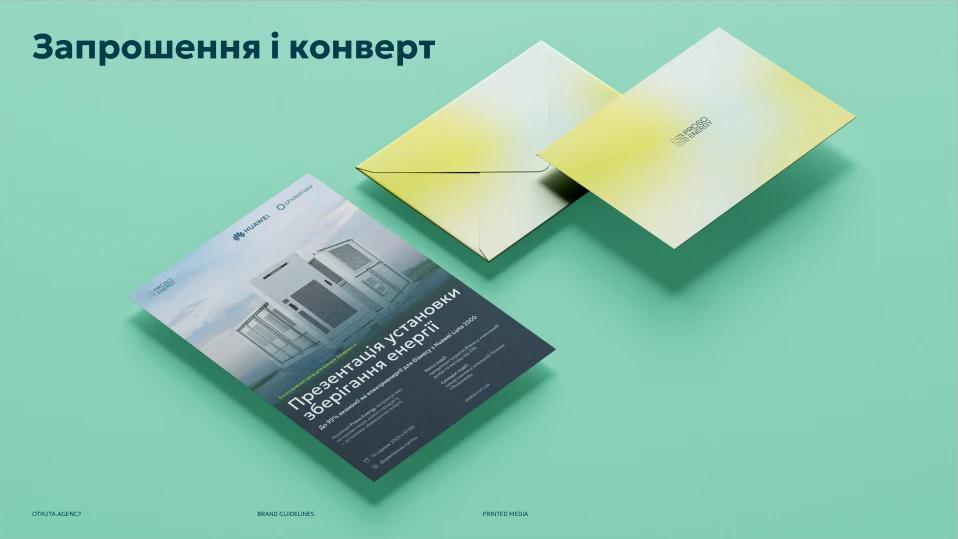
Product design
Product: Energy Management System
Beyond the brand, I designed the UI for Proso’s web and mobile Energy Management System — the app customers use to see what their station produces. The same design system carries into the product: system overview, generation data, battery status, station control and support requests.
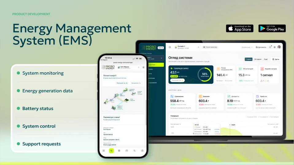
Energy Management System, web and mobile app.
The outcome
Proso now looks the same everywhere — from a Google ad to a branded car to the app on a customer’s phone. The team creates new materials from templates and the brand book, and the identity scales across home and business audiences without splitting into two brands.
3D visualisations and video were produced by partners; I designed the identity, the system and the interfaces they live in.
Results
- brand system across digital, print and product
- 1brand system across digital, print and product
- audiences: business and home
- 2audiences: business and home
- web and mobile app UI designed
- EMSweb and mobile app UI designed
Next case · My Teeth Bliss
Dental clinic branding & website in Berlin